 PlumiBot
Swallow
126 languages · global teams · pills
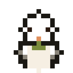
The barn swallow crosses continents — it carries the promise of global reach.
↓ plumi-swallow.pngA quiet, paper-white early-Macintosh desktop that comes alive. The canvas stays calm — mono neutrals, crisp type, 1px hairlines — so the personality can be loud: one warm terracotta accent and a cast of pixel birds. Restraint in color and type; energy in character.
Everything below is in service today — on the marketing site and inside the account dashboard. Nothing here is aspirational, and nothing in either surface is missing from this page.
Neutrals cover ~90% of every screen. Terracotta is a single pop per section — a primary CTA, the active nav link, a key highlight, or a bird's beak and feet. Sage, amber and brick are states, never decoration: they appear only to report success, a quota running out, or something destructive.
Pixel display, clean body. The pixel fonts carry the personality; the body font carries the reading. Never set body copy in a pixel font. Scale: H1 44–52 / H2 28–32 / H3 18–20 / eyebrow 11 (tracked caps) / lede 19 / body 16·1.6 / small 13.
Headings and display. A legible pixel face — characterful, not blocky.
Eyebrows, badges, pills, buttons, and the logo wordmark. Used small and tracked.
All running copy. Chosen for warmth and readability.
Commands, code chips, balances and pixel numerals in stats.
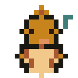
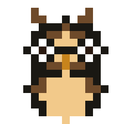
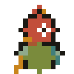
Instead of generic glyphs, each capability has its own bird — a small guide drawn on one shared front-facing template so the flock reads as a family. They share the ink outline; identity comes from color and one bold feature. The original carrier pigeon stays the sole brand logo; these are its guides. All seven double as the profile picture a signed-in visitor can pick in Settings. Every sprite is downloadable as a 256px transparent PNG.
The barn swallow crosses continents — it carries the promise of global reach.
↓ plumi-swallow.pngOlive sprig in its beak — for clarity, context, and the people who love across languages.
↓ plumi-dove.pngThe songbird, mid-note — voice notes transcribed and translated.
↓ plumi-canary.pngSpectacled and studious — it reads menus, signs and documents, and helps you learn.
↓ plumi-owl.pngLoud, colorful and playful — the face of Word Chain and Translation Duel.
↓ plumi-parrot.pngA collector of shiny things — it keeps the tallies, leaderboards and referral counts.
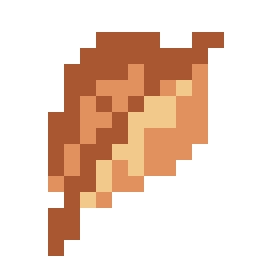
↓ plumi-magpie.pngThe namesake feather — a quill for summaries and the on-demand digest. It is the brand's glyph.
↓ plumi-feather.pngEvery icon on both surfaces is drawn by the same engine: an empty
span.px that plumibot-pixel.js
fills with 1-bit cells. data-art names the sprite;
data-cell is the pixel size in CSS px, which is how sprites
drawn on different grids end up optically the same size. There are no icon fonts, no SVG icon set and no emoji.
Eight non-bird sprites carry the interface: buttons, the account tab bar, and the outcome screens after a payment.
chatcommandboltarrowdiskcassettefacestarTen platform marks, redrawn on the same 1-bit grid so a third-party logo never breaks the page's own language. Every one renders in the footer — including platforms with no account yet, because a stated absence reads as a decision and an impersonator can't look official.
soc-xsoc-instagramsoc-threadssoc-facebooksoc-youtubesoc-tiktoksoc-githubsoc-linkedinsoc-discordsoc-redditSharp UI, rounded windows: 2px on chips and inputs, 4px on buttons and cards, and 1px hairlines on everything — except the signature Mac window, which rounds to 9px. Shadows are hard offsets with no blur; anything you can press depresses to a flush 0,0 on click.
.btn · --primary --ghost --danger --sm --lg --block · :disabled
Terracotta fill for the one primary action; ghost (no border, no shadow) for everything secondary; brick only where something is destroyed. Block is the phone default — the account area stacks full-width buttons.
.iconbtn (.mode-btn--dark .mode-btn--light · .nav-burger > i) · .mode-row > .mode-opt.is-active
One 44×40 square control, used three times: crescent, sun and phone burger. The two mode buttons are both really in the page and CSS hides whichever one agrees with the palette on screen, so the icon cannot lie and the link still works with JavaScript off — here both are shown at once. The segmented row is the three-state version used in the footer and in Settings; the active segment lifts onto surface.
.badge · .badge--quiet · .pill
Badges are Silkscreen caps in a terracotta wash — quiet is the same shape drained of color, for facts that carry no emphasis. Pills are mono and rounded, and a bird can ride one for warmth.
.plan-chip · .plan-chip--sm
What plan you are on, stated next to your name or a group's. The small size rides inside a list row, where it sits beside the group name rather than above it.
.cmd-inline · .kbd · .tag-os · .mono
Every bot command is a sunk mono chip, in prose as well as in lists — a command should look typed wherever it appears. .kbd labels a control, .tag-os is the mono system-tag voice used for version and copyright lines.
.idbox
A long identifier you are meant to copy, not read: mono, sunk, breaks anywhere, and selects whole on one click.
Lifts 2px toward the light on hover.
Recessed, no shadow — a well, not a tile.
A 72px sunk mat holds the bird above the heading.
.card · .card--hover · .card--sunk · .feat > .ic
The default surface for anything that isn't a window. Only interactive cards get --hover; a card that lifts but does nothing is a lie.
The signature frame: striped title bar, one pixel dot, ~9px top radius. Every panel in the dashboard is one of these.
.win > .win-bar (.win-dot .win-title .win-stripes) + .win-body
Windows group; cards list. If a block has a name worth putting in a title bar, it is a window — the dashboard is a stack of them.
.notice · .notice--ok · .notice--err
A sunk block with a 3px left rule — neutral by default, sage when something worked, brick when it didn't. The rule is the only colored part, so a page of notices never shouts.
.win.danger · .danger-list · .btn--danger
The one place brick is allowed to tint chrome. It sits last on the page, behind a disclosure, and asks you to type the word before the button does anything.
Eyebrow, heading, one line of lede — the opening of every section on the site.
.section (--sunk) > .wrap > .section-head (--center) > .eyebrow · .divider · .acct-or
Every band on the site is a .section holding one
.wrap; the sunk variant alternates the background so neighbouring bands
separate without a border. The eyebrow's terracotta tick is the smallest unit of accent on the site, and
the or-rule separates two ways of doing the same thing, like the two sign-in routes.
--shadow-sm/md/lg/win · --r-sm/md/win · --bw 1px · --bw-strong 1.5px
Three hard offsets at rest, hover and open — no blur, because the light is a desk lamp. Only the Mac window uses a soft ambient shadow, and it is the only 9px corner in the system.
.field > .label + .input / .select / .textarea · .form-row · :disabled
Inputs sit on paper inside a 1.5px border and take a terracotta focus ring. They never drop below 16px: iOS zooms the whole page on a smaller focused field.
Keeps you signed in and remembers the choice you make right here.
Remembers the language and the light or dark setting you picked.
.ck-row > input + div (.ck-name .ck-desc) · .ck-actions
A hand-drawn 24px box, checked in terracotta, sunk and uncheckable when the choice isn't yours to make. Allow and Reject are deliberately the same button: a quieter refusal is the dark pattern that invalidates the consent.
.avatar-pick > .avatar-opt (.is-selected) > .px + .avatar-name · .avatar-none
Radio buttons wearing the cast. The real input is screen-reader-only, so the tile itself is the control — selection is a terracotta border and wash, and the whole fieldset disables together for quick-access visitors. The greeting badge on account home is the same sprite in .acct-avatar.
.tiles > .tile > .tile-num + .tile-label
Four counts, two-up on a phone. The number is display type, the label Silkscreen — the number is the content and the label is furniture.
.scoreboard > .score > .n + .l
The marketing sibling of the tiles: one sunk slab divided by hairlines, terracotta numerals, no card shadows. Facts about the product, not about you.
.meter (--warn --over --mini) > .meter-track > .meter-fill · .meter-row
Barber-striped terracotta in a sunk pill. It turns amber at 80% of quota and brick at 100% — the only automatic color change in the system. Mini is the trackless version inside a group row.
.bars > .bar > .bar-col > .bar-fill · .bar-label
Server-rendered heights, no charting library and no JavaScript. Scanlined fill so it reads as a CRT plot rather than a corporate bar chart.
.acct-balance(-num) · .acct-presets > .acct-preset (.acct-preset-amt .acct-preset-local) · .acct-custom(-row -cur)
Presets are buttons shaped like denominations — they press like a button because they are one. Every NT$ figure carries a live equivalent in the visitor's own currency, except where the visitor already thinks in NT$.
| Rule of thumb | Token cost |
|---|---|
| Text translation | ~350 |
| Voice transcription | ~500 |
| Image OCR | ~1,500 |
| Feature | Free | Personal Pro | Group Pro |
|---|---|---|---|
| Text translation | ✓ | ✓ | ✓ |
| Voice transcription | – | ✓ | ✓ |
| Image OCR | – | ✓ | ✓ |
.tbl-scroll > .tbl (.cmp) · th/td · .c · td.mono · .yes · .no
Silkscreen headers, hairline rows, numbers right-aligned and mono. On a phone the scroller goes full-bleed and fades at the right edge, so it's visible there is more to swipe to.
NT$149 · 10,000 messages/month, everywhere you chat.
.acct-planrow · .acct-grouprow > .acct-grouprow-main · .tx > .tx-amt (--plus)
Three hairline-separated row types inside a window: an offer with an action on the right, a tappable group with its own mini meter, and a money line where credit is the only entry that gets terracotta.
.pricing (--4) > .plan (.plan--featured) > .plan-name + .badge · .plan-price > .per · .plan-local · .plan-tokens · .plan-approx · .plan-feats
Six stacked lines in a fixed order, so four cards line up across even when a plan has
nothing to say on one of them — the free plan keeps an empty .plan-local
rather than closing the gap. Square terracotta bullets instead of ticks, one featured plan carrying the
accent border, and on a phone the grid becomes a column with the featured plan reordered to the top.
.acct-tabbar--bottom / --top > .acct-tab (.is-active)
The same four tabs in two bodies: fixed to the bottom of a phone, folded into the header from 860px up. Only one is ever on screen. The tab you are on is the big one — inactive sprites dim and shrink, so the icon rendering on whole pixels is the one you're looking at.
!lang add <code>.The quieter variant used inside dashboard windows — a Silkscreen caps summary with no plus box.
.qa > summary + .ans · .acct-details > summary
Real <details>, so it works with JavaScript off and is findable by in-page search. The plus square flips to a terracotta minus when open.
The bot speaks far more languages than the site does — this picker only changes the pages.
.lang-opt (.is-active) > .lang-code + .lang-name + .lang-soon · .lang-note · .lang-panel · .lang-settings
No flags — this site draws in 1-bit pixel art, and a two-letter code says the same thing without claiming a language belongs to a country. Rows are 44px minimum. The same rows sit behind the nav dropdown and laid flat in Settings.
Add PlumiBot on LINE. Tap the button and say hi.
Type !login in the chat. It hands back a link to this dashboard.
.tut-num · .acct-step · .tut-step > .tut-text
A terracotta Silkscreen square, 32px. On the marketing tutorial it sits above the copy beside a phone mock; in the account area the same numeral runs down a hairline-separated list.

.qr > .qr-tile > img
The one element that must not follow the palette: its mat is a literal #EFEBE2 in both modes, because a QR inverted to light-on-dark does not decode.